Brand guidelines
One house.
Made to last.
How to use the Oakspine Press name, logo, colours and type. For printers, designers, distributors, the press and our own team. When in doubt, use less, and keep it the same everywhere.

01 · The name
Oakspine Press
The house behind every book we publish.
Oak is the tree that is planted for the next generation. The spine is the part of a book you meet on every shelf. Press is the old word for a publishing house. Together: books made to last.
- Write Oakspine Press in full the first time, then Oakspine.
- One word, capital O only. Say it “OAK-spine”.
- Never Oak Spine, OakSpine, Oakspine Publications or Oakspine Books.
- Don’t write OAKSPINE in capitals in running text. Capitals belong to the logo.
02 · The mark
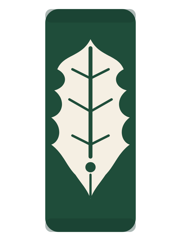
A leaf, a spine, a pen
Three ideas, one shape. Nothing in it is decoration.

- 1
The spine
The block is a book standing on the shelf, with its head and tail caps. Every book we make has one.
- 2
The oak leaf
Strength, patience and growth: the tree that outlives the people who plant it. Its four rounded lobes are the oak's signature.
- 3
The pen nib
The leaf's midrib runs down into a breather hole and a slit: the point of the leaf is the point of a pen. Everything starts with writing.
03 · Logo
The files
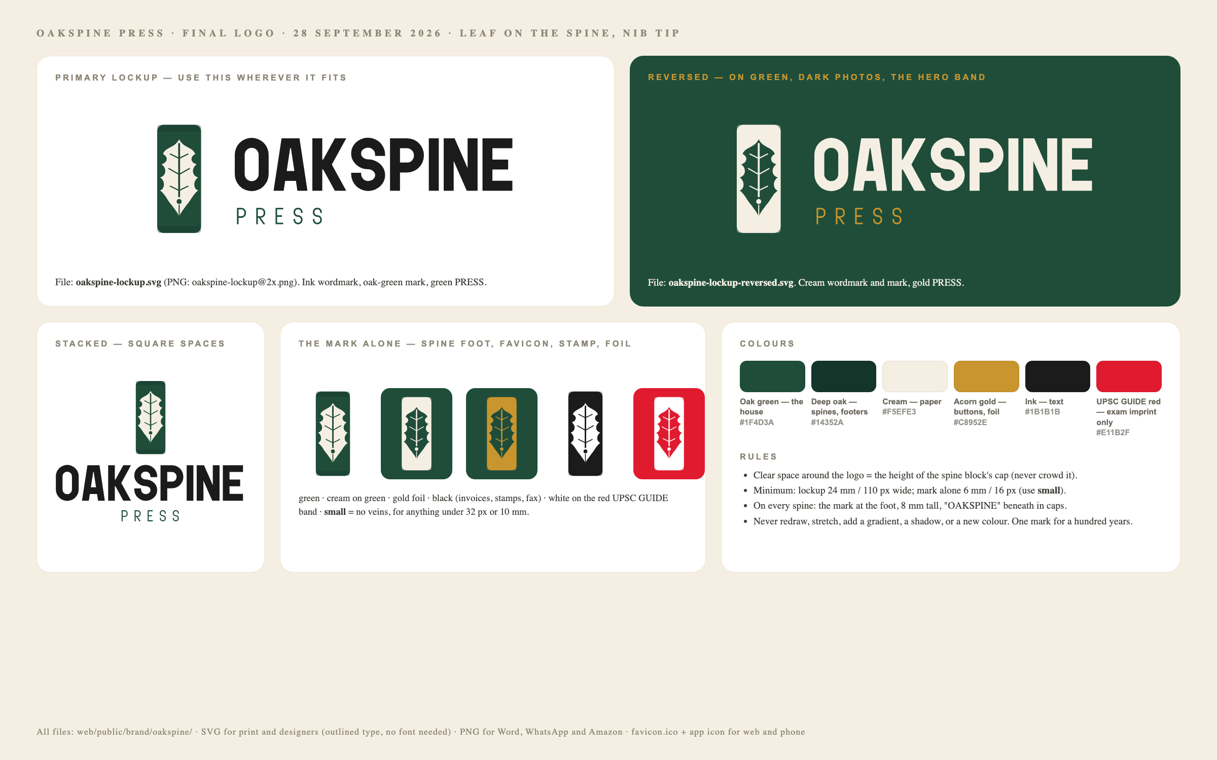
SVG for designers and printers (the lettering is converted to shapes, so no font is needed). PNG for Word, WhatsApp and marketplaces.
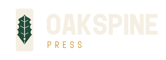
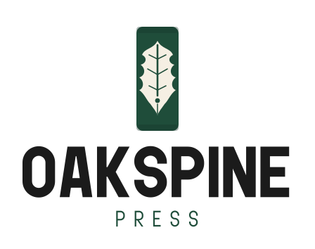
The mark in every colourway


Icons: app icon · social avatar · favicon.ico · one-page logo sheet
04 · Space and size
Give it room
- Clear space: keep an empty margin around the logo at least as wide as the spine block. Nothing else inside it.
- Lockup minimum: 24 mm wide in print, 110 px on screen.
- Mark minimum: 6 mm / 16 px. Below 10 mm or 32 px, use the small file (no veins, heavier lines).
- On a spine: the mark at the foot, 8 mm tall, with OAKSPINE below it in capitals. Same size on every book, always.
 clear spaceOAKSPINE
05 · Colour
Oak, cream and a little gold
Roughly 60% cream, 30% oak green, 10% gold. CMYK values are a starting point: always approve a printed proof.
- HEX
- #1F4D3A
- RGB
- 31 · 77 · 58
- CMYK
- 60 · 0 · 25 · 70
The house colour. Logo, spines, headers, the author portal.
- HEX
- #14352A
- RGB
- 20 · 53 · 42
- CMYK
- 62 · 0 · 21 · 79
Spine bands, footers, pressed and hover states.
- HEX
- #F5EFE3
- RGB
- 245 · 239 · 227
- CMYK
- 0 · 2 · 7 · 4
Paper. Backgrounds, the reversed mark, book interiors.
- HEX
- #C8952E
- RGB
- 200 · 149 · 46
- CMYK
- 0 · 25 · 77 · 22
Buttons, prices and gold foil. Use sparingly.
- HEX
- #1B1B1B
- RGB
- 27 · 27 · 27
- CMYK
- 0 · 0 · 0 · 89
Text and the wordmark on light backgrounds.
UPSC GUIDE red #E11B2F belongs to the competitive-exams imprint only: its covers, its spines and its pages on this site. Never use red for the house, and never use oak green on a UPSC GUIDE cover band.
06 · Type
Three typefaces
Headlines shout, the serif speaks, the body text explains.
Headlines and the wordmark
Giant Impact
Black and Regular weights, always in capitals. Page titles, banners, spine titles, the OAKSPINE wordmark.
Quotes and book moments
RCL Arviel
Pull quotes, author lines, the first line of a book spotlight. Use in small doses.
Reading
Manrope
Everything people read at length: guides, descriptions, forms. 16 px minimum on screen. Hindi and Marathi use Noto Sans Devanagari and Tiro Devanagari.
Giant Impact and RCL Arviel are licensed through Envato Elements. Register each new use (a book cover, a print campaign) in the Envato licence before you publish it.
07 · One house, many shelves
The house and its imprints
Oakspine Press is the publisher on every book. Each market gets its own imprint name and colour; the leaf stays on every spine.
Oakspine Press
The house. Trade books, memoir, contracts, the website, invoices, the author portal.

UPSC GUIDE
Competitive-exam imprint. Written on the book as “UPSC GUIDE, an Oakspine Press imprint”.
08 · On the book
Where the name goes
Spine
The mark at the foot, 8 mm tall, OAKSPINE beneath. Title and author read top to bottom.
Front cover
The imprint leads (for exam titles, the UPSC GUIDE band). The Oakspine mark sits small in a corner of the band.
Title page
The stacked lockup at the foot of the page, centred.
Copyright page
“Published in India by Oakspine Press”, followed by the registered company name, address, ISBN and edition.
09 · Voice
How we sound
Write the way a good officer briefs: clear, specific, calm.
Plain
Short words, short sentences. Say what the book does for the reader.
- Twelve years of Mains questions, arranged by topic.
- A revolutionary, game-changing preparation experience.
Proven
Every claim can be checked: a number, a name, a source.
- Written by an IPS officer who cleared the exam.
- India's most trusted exam book.
Respectful
Readers are adults preparing for hard exams. No hype, no fear.
- Here is how to use the last ten years of papers.
- Don't fail AGAIN this year!!
Lasting
Write so the page still reads well in ten years. Avoid slang and trends.
- Revised for the 2026 notification.
- This book is lit 🔥
Money in the Indian system (₹12,34,567 · ₹76.1 L · ₹1.2 Cr). Indian English spelling. Officers’ ranks as they print them: IAS, IPS, IRS.
10 · Please don't
Keep the mark whole
A mark becomes famous by staying exactly the same for years. These are the ways it gets broken.
Don't stretch or squash it
Don't rotate it
Don't recolour it
Don't add shadows or glows
Don't put it on a busy photo
✨Don't redraw or add to it
Need something else?
Printers and partners can ask for print-ready files, Pantone matches or approval of a layout at hello@oakspinepress.com.
About Oakspine Press